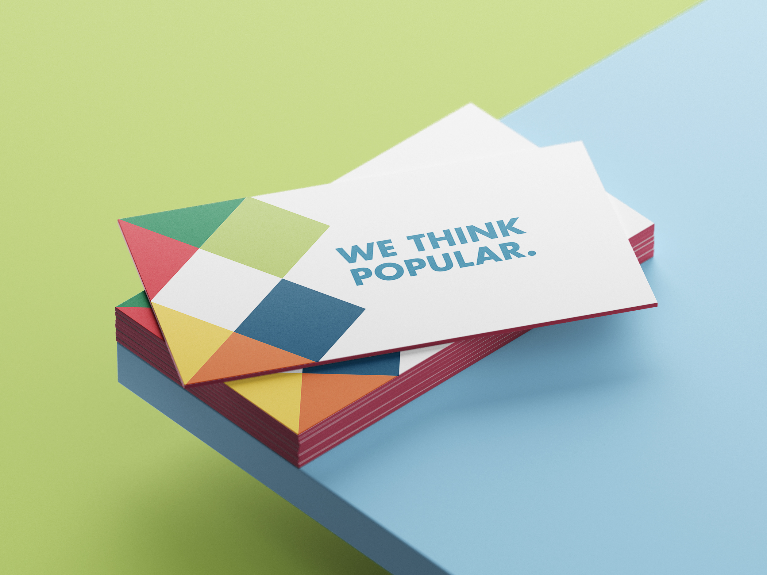
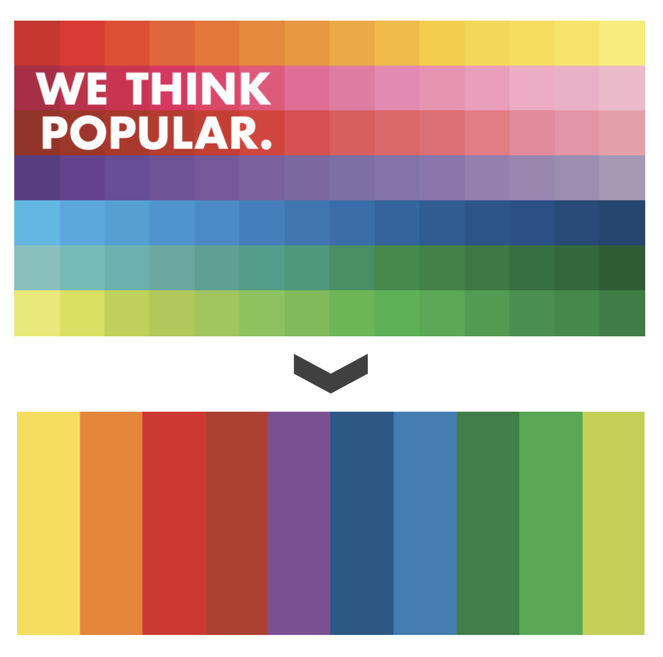
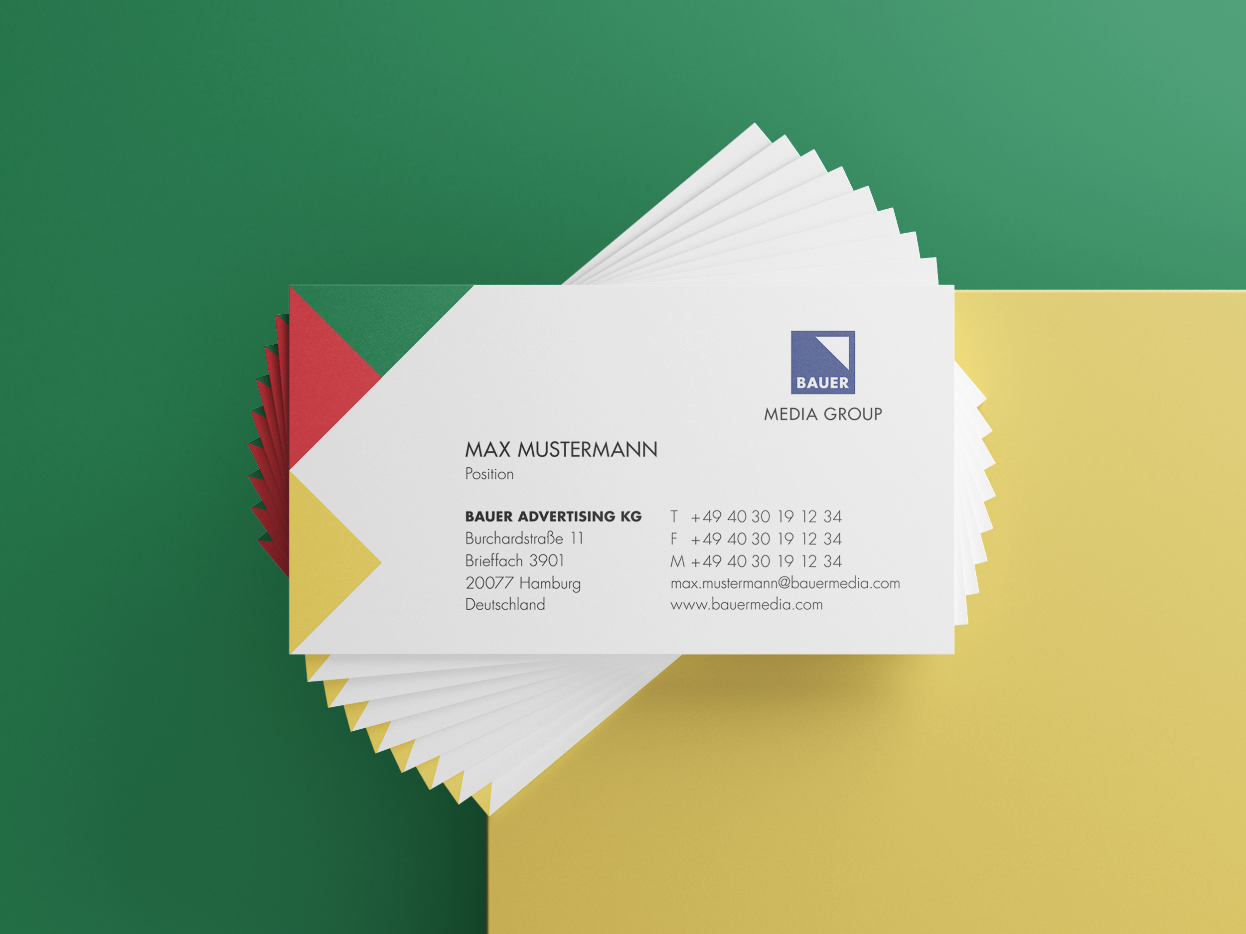
Bauer Media’s corporate design rested on a handful of elements: the Bauer Media Group logo, the tagline „We think popular“, and a key visual made up of 98 colours arranged in a tile pattern, with a single-colour tile used as an alternative.
The key visual read as too busy and not premium enough. On top of that, every corporate design element sat rigidly next to the others, almost like modular building blocks. So the brief was to rework the „key visual“ and „brand stage“ elements so that both B2B and B2C audiences would read the overall brand as more premium, fresher and more consistent – while keeping the recognisable core of the brand intact.
The 98-colour key visual was meant to abstractly capture the range and versatility of what the Bauer Media Group offers. Getting that across, though, does not take 98 colours. What was needed here was a clear but still consistent reduction to a handful of primary colours – more than the single colour currently used for the plain tile version, but far fewer than before.