Introduction

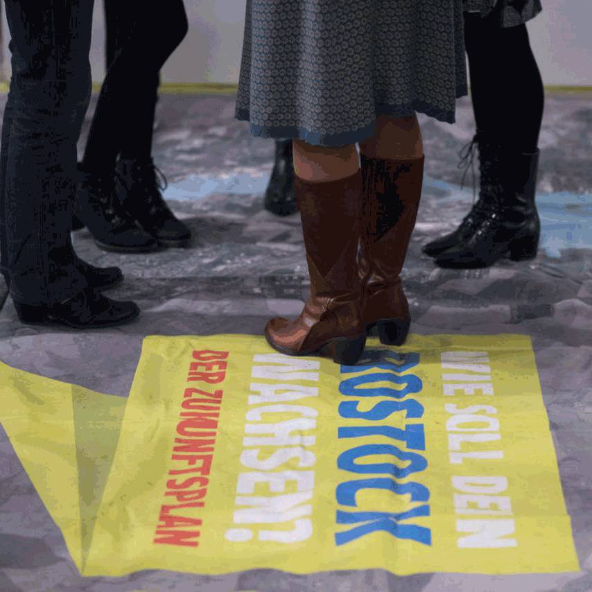
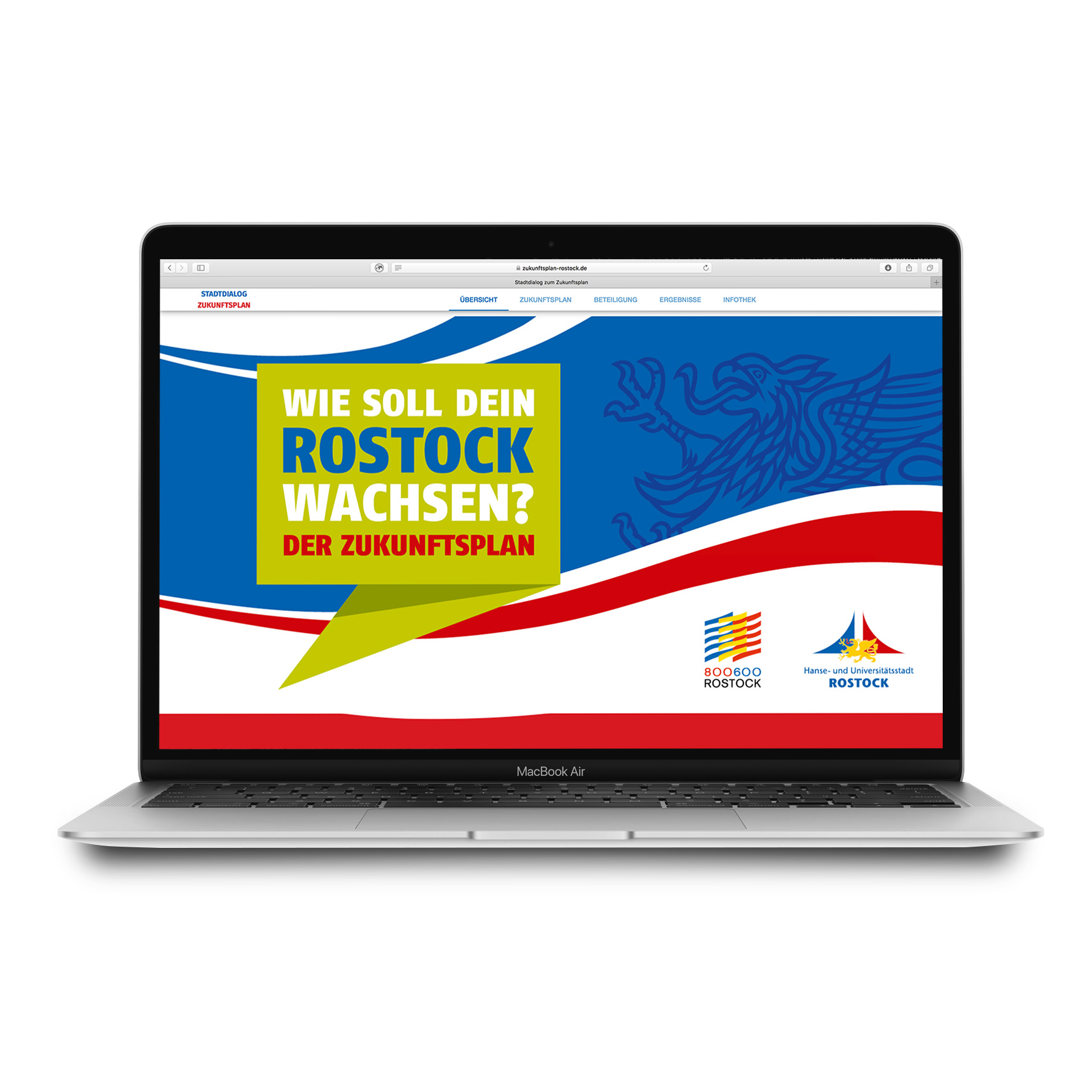
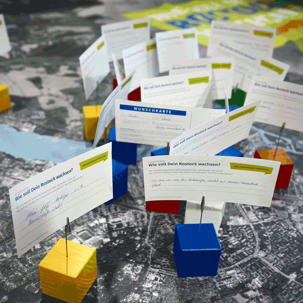
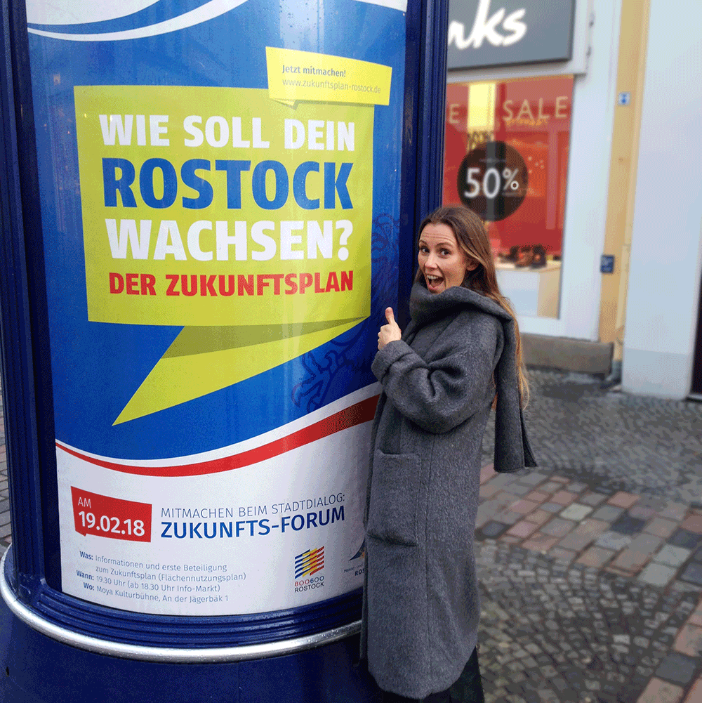
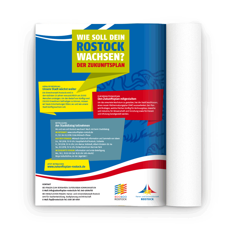
Graphix Island developed the corporate identity for the city of Rostock’s future initiative. The logo also works as an invitation to Rostock’s residents to help shape their own city. The logo, together with a bold, high-contrast colour concept and angular shapes fitting for a Hanseatic city, is one that sticks in people’s minds. That is how the project keeps the city in the public eye, year after year.

It was an exciting project and we are genuinely glad to have been part of it – especially since our founder’s own roots are in this Hanseatic city.
Client

Superurban Kommunikation and the city of Rostock

Scope

Corporate design

About the client

In November 2019, three public forums discussed the potential for infill development in Rostock’s residential areas. Where in the district could still be built on? What should stay as it is, and what needs improving – what is missing? Those questions were at the centre of the discussion, which drew numerous participants from Lütten-Klein, the city centre and Toitenwinkel. Any interested Rostock resident could take part and put forward ideas for the built and green development of their neighbourhoods. The results have been published, forming part of the wider assessment of Rostock’s infill development potential and complementing the existing urban planning studies and other technical concepts.

Palm tree motif as the footer image of the Stadtklima Altona project, symbolising climate change in the city

Start your project with us